Hot off the digital anvil, an iOS app for blind and low-vision people to collect videos for the ORBIT dataset project. The client for the ORBIT Data server. Written in Swift, using UIKit, UIAccessibility, AVFoundation, GRDB[1], and Ink.
First-run
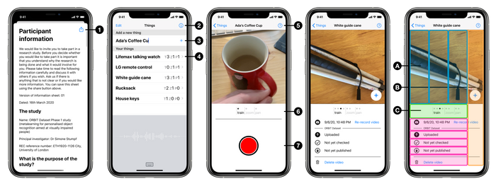
On first-run, the user gives research project consent. This is a two-page modal screen, first with the ethics committee approved participant information, then the consent form. The participant information page has a share button ①, which will produce a HTML file. This provides an appropriate and accessible equivalent to providing a physical copy of a participant info hand-out.
On providing consent, the server creates the participant record and supplies credentials that the app will then use to further access the API endpoints. The app does not have any record of the personally identifiable information given as part of consent, or which participant ID it represents, it only has the set of credentials.
This two-screen, step-through, first-run is simpler than my UX pitch. That had the idea of being able to test the app before consent, in order to ’show not tell’. I was in a ‘selling it’ mindset, whereas our participants would already have been recruited to some degree, so the onus was on getting them collecting data as quickly as possible, with the UX quality to keep them there.
Things list screen
The app follows the Master-Detail pattern. The Master screen lists all the Things the user has added. A thing is something that is important to the user, that they would like a future AI to be able to recognise. Things are created with a user-supplied label ③.
Plus an app/project information modal screen, accessed via ②.
A glaring ommission from my UX pitch, fixed here in ④, is tallies for video counts.
Thing record and review screen
This is the detail screen, of the thing-centric Master-Detail pattern. The aim of the app is to capture imagery of a thing, following a certain filming procedure. Visually, this screen presents a carousel of videos organised into the different categories of procedure. For each category, there are the videos already taken, plus a live-camera view as the last entry to add a new video. Information and options relating to the video selected in the carousel appear below, with a camera control overlay when appropriate.
The big change since my UX pitch is losing the fixed slot paradigm. There was a desire not to ‘bake in’ the data collection procedure, so many of the conceptual or UX simplifications have been lost in favour of open-ended collection.
The voiceover experience has a different structure. Here, the user first selects the procedure category Ⓐ, within which they can add a new video to that category Ⓑ or review existing videos for that category Ⓒ.
Plus a filming instructions screen, accessed via ⑤.
UI Notes
For voiceover, the touch targets of the UI elements were often inadequate. The clearest example of this is the close button of the first-run / app info / help screen. Swiping left and right through the long-form text to get to this control was impractical. Plus the button was hard to find, partly because it’s small and top-right, and partly of being swamped by this content. So the accessible experience was re-jigged to have this close control be a strip along the right-hand-side edge. Another clear example is the camera’s start/stop button accessible touch target extends to the screen edges ⑦. This means that most screens actually have an entirely bespoke accessiblity layer.
More gratuitously, the slick UX centered around the carousel took some coding. The pager does a lot more work, being split into filming procedures with the ‘add new’ tailing element for each procedure section ⑥; it got super-positive feedback from testers used to the first iteration with just a plain pager and selection of filming type for every recording. The carousel itself features multiple camera viewfinders, which meant a lower-level approach than AVCaptureVideoPreviewLayer was required.
“because one sometimes enjoys a sharp tool” ↩︎


